Monday 24 May 2010

Rotation Room Mock Up

So I've just received the mock up of the rotation room, featuring my character Lucretia, Tom's holographic info cards and Cat's room.

I've got to say that the outcome is even better than I had envisioned, and I'm really glad that the three of us worked together on this to produce it.

So this is what happens when the player begins the game. He/She is given 9 characters to choose from, and once the player confirms that the highlighted character is the right choice, the "A" button would be pressed and would then lead on to the second image, where the character bio, weapons and stats are shown. If the player so chooses, they can go backwards and choose a different character until they find one that they're happy with.

(Let it play through at least once so that it gets to the right speed)


Selection Screen test 1

Right, so I'm not totally sure if this will work online, but here is the first test for my character selection screen.

It runs a lot smoother than this when not online, which is really starting to annoy me
cause it looks absolutely awful on here. Why it wont run at the right speed I don't know D: If you let it play through a few times it does actually speed back up again, which is better than nothing I guess.

(CLICK TO SEE IT AT FULL SIZE)


It does wobble around a lot, but that's because I didn't take ages to line each frame up, which I will do for the final piece. Over all though, I'm stupidly pleased with this, it came out a lot better than I expected, so I just need to tidy it up now ^^

Sunday 23 May 2010

The Male Denalarai

Here is the male Denalarai I mentioned several posts ago that I would do. This was very much a quick break with everything else, which thankfully is nearly finished.

As you can see here, he is a totally different colour to the female that I drew. This is purely because the Denalarai can be found in a wide range of colours, which often represent what kind of environment they live in. Although they are fantastic warriors, they do not seek to conquer other planets and their peoples. Their society is heavily moral based, and they are a very honourable race.

More inspiration

I just wanted to quickly write about another artist that I've recently started following, and that is Michel Victor.

I discovered his art through a contest on DeviantArt, and I'm just totally blown away by how unique is artwork is. Not only are they painted beautifully, and look incredibly realistic, but they move. That's right- he's taken it one step further, and animated the characters and their backgrounds, added music, and the effects are stunning. It's important to create an atmosphere in any painting, but all the extras that this artist puts into his work creates so much more emotion.

Here are some of my favourites:

Kaliza (This is the piece that led me to look through more of his work).
Akina
Sonhos

So yeah, I really find these incredibly inspirational, and it's something that I'd really like to play around with and try myself, which is how I came up with the idea to animate my selection screen.
I'll update my blog later on with the initial animation once it's finished, and explain the process that I went through to animate it, and what I want to improve and carry on with.

Selection screen research

Right, so before I began to design the selection screen, I realised that I was going to have to look at and evaluate several different existing selection screens featured in various games. Some of them I really liked and too inspiration from, a lot I didn't like at all.
So please brace yourself for a very long post, as there's lots for me to go through.

:NOTE: The images in this specific post are not mine, I do not claim that they are in anyway, and they are copyright to their rightful owners.


So this was the first selection screen that I looked at, and gathered inspiration from to create this first draft.

Looking at it now, I don't think it's particularly anything amazing. I'm not sure exactly what game it was from, so I don't know what era it came from, which could explain the blocky graphics if it's quite an old game, although by the looks of it it was on one of the xbox platforms.
One thing that I really did like in this design though was the maximised image on the right hand side of which ever character the cursor is on.
How ever much I like that idea though, I think it's been pulled off quite badly in this shot, as the full scale portrait of the selected character is quite a confusing image. I think what causes this is the mirror behind the character, and the extended arm over the dark background. The characters blue colouring also doesn't help to stand out from the rest of the image either, which further contributes to the confusion of the eye.

And so after I created the first mock up I realised that I was going to have to look at several other examples until I found enough aspects that I liked and could incorporate into my own design.

Most of the next images that I researched didn't really inspire or influence me in anyway, nor did they stand out for me either.


The only things that really stood out for me was the really detailed portrait of Darth Vader on the Soul Calibur screen (the first of these four images) and the really detailed character icons on the Mortal Kombat screen (the last image). The idea of incorporating these two aspects allowed me to further develop my original design to what it is now.

There is one final selection screen that I want to feature, and that's the one that stood out and appealed the most to me. It's quite delicate and beautiful looking, with really interesting details on the character icons.


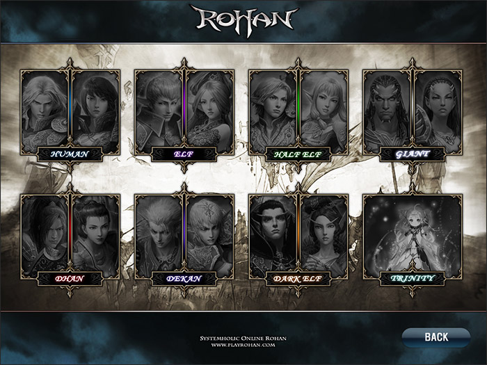
After seeing this design, it inspired me to experiment with the icon borders, which is where this came from. I also really liked the soft quality that the design has, and the two sketches on either side of the screen.

So that's all the research I conducted for my selection screen, and I really think that the outcome of my design would have been totally different to the one I have now if I hadn't looked at existing designs. I also think that my own work would have been a lot weaker if I hadn't.

Character Selection screen- final

I think I was right in my last post- I had been staring at the screen for too long. I've just gone back to the selection screen and played around with more texture brushes, and I've got to say I'm a lot happier now.

As well as the Steampunk cog brushes that I mentioned in my last post, I also used "Ripe grunge extreme brush pack" and "3rd brush pack- '13'"


I think the only thing that I may very well change is to make it a little more vibrant. Not sure yet. Right, I'm off to figure out how to animate the damned thing :D I'm not one for animating big things, but I could get used to do incorporating it into my work, and I even enjoy doing it to some extent.

The next post really will be research now, as I want to explain several inspirations for this selection screen. I'll update later with the selection screen animated hopefully ^^

Saturday 22 May 2010

Happy, but...

I'm happy with the selection screen except for one tiny, little part...the background >.<

Without background so that you can see all the character icons clearer.

I'm really pleased with the little icons on each character panel, and I'm happy with the over all lay out. But then I begin to try and fill the background in and it becomes FAIL.

With one example of a background.


I think it has potential, but right now it's bothering me. To me it looks too...smooth? I think it needs some sort of texture to it, but I don't want to over do it. I also think that it looks too PlayStation 1 era. Maybe I just need to stop staring at it for a while, and come back to it tomorrow morning. Still, as much as it bothers me, I still think it's an improvement from the last mock ups.

I used these Steampunk cog brushes for the background.