So I did several mock ups, and then combined the two that I liked the most, which was the second and third designs. I used this Art Nouveau Border Stock as inspiration for borders 3 and 4.
Once I had chosen which design I liked the most, I then went on and tried a few of the other character icons with it to see if it worked well. I'm happy with the design, so I'm now going to move on and try a few different colour variations. I like the idea that the little designs on the corners could look like a little machine which then projects the character's portrait as a hologram. I'm going to definitely experiment with that idea, so there'll probably be an update later on.


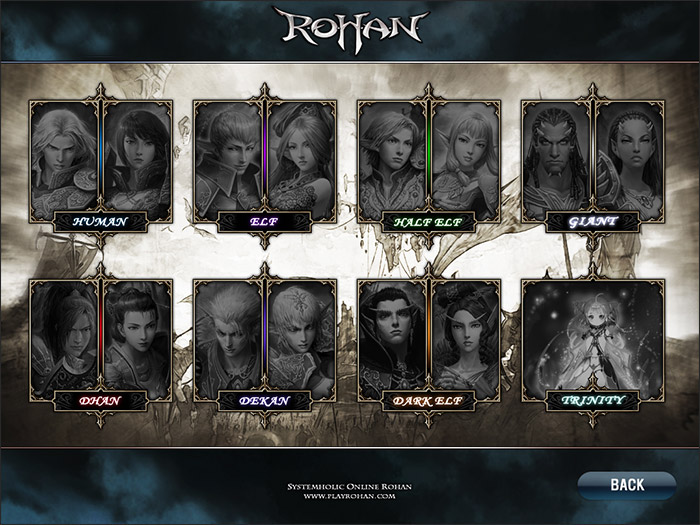
I'll go into this in a bit more detail in my next post, but I just wanted to quickly mention what inspired me to change the style of my selection screen. I found this whilst doing research, and just thought it look really beautiful and very unique as a selection screen, so it got me thinking again.
I've got some research I want to stick in here, so look out for a more detailed explanation on the inspiration in the next post.

No comments:
Post a Comment