Sunday, 23 May 2010

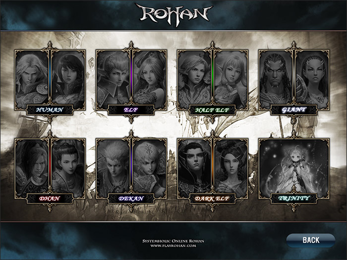
Character Selection screen- final

I think I was right in my last post- I had been staring at the screen for too long. I've just gone back to the selection screen and played around with more texture brushes, and I've got to say I'm a lot happier now.

As well as the Steampunk cog brushes that I mentioned in my last post, I also used "Ripe grunge extreme brush pack" and "3rd brush pack- '13'"


I think the only thing that I may very well change is to make it a little more vibrant. Not sure yet. Right, I'm off to figure out how to animate the damned thing :D I'm not one for animating big things, but I could get used to do incorporating it into my work, and I even enjoy doing it to some extent.

The next post really will be research now, as I want to explain several inspirations for this selection screen. I'll update later with the selection screen animated hopefully ^^

Saturday, 22 May 2010

Happy, but...

I'm happy with the selection screen except for one tiny, little part...the background >.<

Without background so that you can see all the character icons clearer.

I'm really pleased with the little icons on each character panel, and I'm happy with the over all lay out. But then I begin to try and fill the background in and it becomes FAIL.

With one example of a background.


I think it has potential, but right now it's bothering me. To me it looks too...smooth? I think it needs some sort of texture to it, but I don't want to over do it. I also think that it looks too PlayStation 1 era. Maybe I just need to stop staring at it for a while, and come back to it tomorrow morning. Still, as much as it bothers me, I still think it's an improvement from the last mock ups.

I used these Steampunk cog brushes for the background.

Icon designs

Still working on the character selection screen, and I'm currently focusing on making the icons look nicer and just generally tidier.
So I did several mock ups, and then combined the two that I liked the most, which was the second and third designs. I used this Art Nouveau Border Stock as inspiration for borders 3 and 4.

Once I had chosen which design I liked the most, I then went on and tried a few of the other character icons with it to see if it worked well. I'm happy with the design, so I'm now going to move on and try a few different colour variations. I like the idea that the little designs on the corners could look like a little machine which then projects the character's portrait as a hologram. I'm going to definitely experiment with that idea, so there'll probably be an update later on.


I'll go into this in a bit more detail in my next post, but I just wanted to quickly mention what inspired me to change the style of my selection screen. I found this whilst doing research, and just thought it look really beautiful and very unique as a selection screen, so it got me thinking again.

I've got some research I want to stick in here, so look out for a more detailed explanation on the inspiration in the next post.

Wednesday, 19 May 2010

Character selection screen 2

So as suggested by zombryn, I changed the hue on the selection screen, and I've got to say, I like a lot more now. It fits in with Tom's green hologram design a lot more now, which pleases me. There's something still bothering me, which is probably mainly because it's only a messy mock up, which is why there is a grey patch in the middle.
I'm still going to try a few other different styles, but at least I know now what I'm doing and what kind of colour theme will work with the rest of the project.


I'm absolutely knackered now, so that's all for tonight I think.

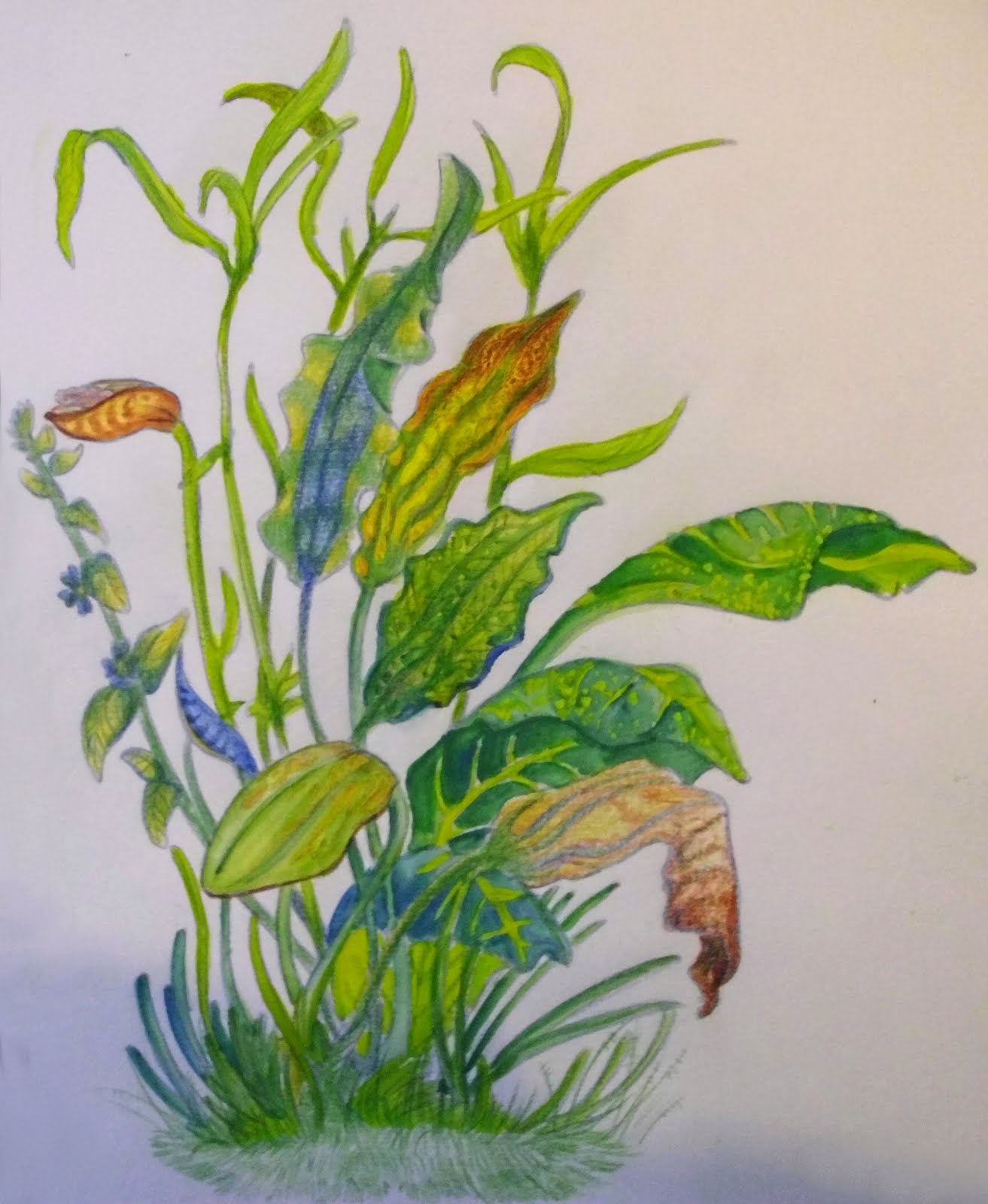
Pretty flowers

Taking a quick break from research, I realised that I doodled something the other day and hadn't put it up here yet, so here it is I guess:


I was wondering what plants might look like on another planet, so I doodled up some different leaves and flower types that the player might encounter in the game when on new planets. Some of the shapes were referenced from aquatic plants, as I was looking through a catalogue of plants for fish tanks, though of course they are no where near as bright as that.

Gouche paints and coloured pencils.

Oh, and I got a better picture of the Denelarai race that I posted earlier- you can see the features better now I think.

More inspiration

NOTE: Any images in this specific post are NOT my own, I do not in anyway claim that they are, and they are copyright to their rightful owners.

Another artist that has continued to influence me over many years isn't in fact a concept artist. Kay Nielsen's, -who was an illustrator in what was known as the "Golden Age of Illustration"- work has always fascinated me, and I think it's mainly because of the gorgeous colours and the subject of his work, which were usually based around some kind of mythology, which I find fascinating anyway.
His beautiful, flowing forms gently lead the eye around the piece, and create a lovely fantasy like atmosphere.


The image above is my very favourite of Nielsen's pieces, primarily because the colours are just so appealing to me. Another reason I believe that I am so drawn to this illustrators work is because of the amount of beautiful and intricate detail that Nielsen put into his work. I absolutely adore detail, and when I finally get to put loads into a piece I enjoy it immensely, something I think which was influenced from looking at Nielsen's work.

Over the summer holiday I hope to experiment with and push my style and see if I can include some hints of influence from the Golden Age of Illustration, as I think it can really add to a painting.

The start of research

So I realised that I haven't uploaded any of my research yet. The next few posts will contain various things such as looking at existing:

* Character selection screens
* Concept artists
* Concept art
* Character portraits
* Games
* Sci-fi themed stuff

The main aim for doing this is to show where some of my inspiration comes from, what I have learnt, and to evaluate existing work in order to better understand the process of designing a game.

NOTE: Any images in this specific post are NOT my own, I do not in anyway claim that they are, and they are copyright to their rightful owners.

So I'm going to start off with some research into Concept artists. As this is the area that I want to go into myself, I feel that it's really important that I keep update with what is going on in the game art world.

My favourite concept artist currently is Romanian born Daniel Dociu.

I find it rather odd that I am so drawn to his work, as his work is just so raw and harsh, which oddly enough is the complete opposite to what I personally create. My own work is always very refined and tidy, and it must be the appeal of being able to draw so freely that draws me to his art.
He mainly does environmental art, but there is some character concept in there too.

Have a look at these pieces, which are some of my favourites, and include both his environment and character designs.

Armor Girl
Delta Temple
Puppet
Goth
Mine

Dociu’s work is very recognisable and unique, and that’s largely down to the fact that his work is always very raw and passionate, which conveys a lot of emotion, especially tension and atmosphere.
His environmental designs create this not only when viewing them on paper, but also when encountering them in the game itself. In game his landscapes cause the viewer to behold them in wonder, and can even cause fear and apprehension.

Dociu has fairly quickly become a successful concept artist, and has worked for several companies, including smaller businesses. His more notable placements include Art Director for big gaming companies such as Squaresoft, Electronic Arts and Zipper Interactive. He has also done free lance work for companies such as Digital Anvil and Wizards of the Coast.
Since 2003 to the present day Dociu has worked specifically with AreaNet on their immensely successful game Guild Wars as an Art Director and lead concept artist. This has led him to also work since 2007 as the Chief Art Director for the company NCsoft, the parent company to AreaNet. His role involves the overseeing of the visual development of all of NCsofts’s major North American projects, focusing especially on AreaNet’s newest game, Guild Wars 2, a game which I am looking forward to imensly, as it looks like it is going to be one of the most beauitful games around.

Check out this teaser trailer that introduces the playable races in Guild Wars 2.

I could carry on writing about Dociu's work, but I don't really want to turn this into an essay (...yes, I have writen an essay on Dociu in the past :P), so on to the next artist.