Monday 24 May 2010

Rotation Room Mock Up

So I've just received the mock up of the rotation room, featuring my character Lucretia, Tom's holographic info cards and Cat's room.

I've got to say that the outcome is even better than I had envisioned, and I'm really glad that the three of us worked together on this to produce it.

So this is what happens when the player begins the game. He/She is given 9 characters to choose from, and once the player confirms that the highlighted character is the right choice, the "A" button would be pressed and would then lead on to the second image, where the character bio, weapons and stats are shown. If the player so chooses, they can go backwards and choose a different character until they find one that they're happy with.

(Let it play through at least once so that it gets to the right speed)


Selection Screen test 1

Right, so I'm not totally sure if this will work online, but here is the first test for my character selection screen.

It runs a lot smoother than this when not online, which is really starting to annoy me
cause it looks absolutely awful on here. Why it wont run at the right speed I don't know D: If you let it play through a few times it does actually speed back up again, which is better than nothing I guess.

(CLICK TO SEE IT AT FULL SIZE)


It does wobble around a lot, but that's because I didn't take ages to line each frame up, which I will do for the final piece. Over all though, I'm stupidly pleased with this, it came out a lot better than I expected, so I just need to tidy it up now ^^

Sunday 23 May 2010

The Male Denalarai

Here is the male Denalarai I mentioned several posts ago that I would do. This was very much a quick break with everything else, which thankfully is nearly finished.

As you can see here, he is a totally different colour to the female that I drew. This is purely because the Denalarai can be found in a wide range of colours, which often represent what kind of environment they live in. Although they are fantastic warriors, they do not seek to conquer other planets and their peoples. Their society is heavily moral based, and they are a very honourable race.

More inspiration

I just wanted to quickly write about another artist that I've recently started following, and that is Michel Victor.

I discovered his art through a contest on DeviantArt, and I'm just totally blown away by how unique is artwork is. Not only are they painted beautifully, and look incredibly realistic, but they move. That's right- he's taken it one step further, and animated the characters and their backgrounds, added music, and the effects are stunning. It's important to create an atmosphere in any painting, but all the extras that this artist puts into his work creates so much more emotion.

Here are some of my favourites:

Kaliza (This is the piece that led me to look through more of his work).
Akina
Sonhos

So yeah, I really find these incredibly inspirational, and it's something that I'd really like to play around with and try myself, which is how I came up with the idea to animate my selection screen.
I'll update my blog later on with the initial animation once it's finished, and explain the process that I went through to animate it, and what I want to improve and carry on with.

Selection screen research

Right, so before I began to design the selection screen, I realised that I was going to have to look at and evaluate several different existing selection screens featured in various games. Some of them I really liked and too inspiration from, a lot I didn't like at all.
So please brace yourself for a very long post, as there's lots for me to go through.

:NOTE: The images in this specific post are not mine, I do not claim that they are in anyway, and they are copyright to their rightful owners.


So this was the first selection screen that I looked at, and gathered inspiration from to create this first draft.

Looking at it now, I don't think it's particularly anything amazing. I'm not sure exactly what game it was from, so I don't know what era it came from, which could explain the blocky graphics if it's quite an old game, although by the looks of it it was on one of the xbox platforms.
One thing that I really did like in this design though was the maximised image on the right hand side of which ever character the cursor is on.
How ever much I like that idea though, I think it's been pulled off quite badly in this shot, as the full scale portrait of the selected character is quite a confusing image. I think what causes this is the mirror behind the character, and the extended arm over the dark background. The characters blue colouring also doesn't help to stand out from the rest of the image either, which further contributes to the confusion of the eye.

And so after I created the first mock up I realised that I was going to have to look at several other examples until I found enough aspects that I liked and could incorporate into my own design.

Most of the next images that I researched didn't really inspire or influence me in anyway, nor did they stand out for me either.


The only things that really stood out for me was the really detailed portrait of Darth Vader on the Soul Calibur screen (the first of these four images) and the really detailed character icons on the Mortal Kombat screen (the last image). The idea of incorporating these two aspects allowed me to further develop my original design to what it is now.

There is one final selection screen that I want to feature, and that's the one that stood out and appealed the most to me. It's quite delicate and beautiful looking, with really interesting details on the character icons.


After seeing this design, it inspired me to experiment with the icon borders, which is where this came from. I also really liked the soft quality that the design has, and the two sketches on either side of the screen.

So that's all the research I conducted for my selection screen, and I really think that the outcome of my design would have been totally different to the one I have now if I hadn't looked at existing designs. I also think that my own work would have been a lot weaker if I hadn't.

Character Selection screen- final

I think I was right in my last post- I had been staring at the screen for too long. I've just gone back to the selection screen and played around with more texture brushes, and I've got to say I'm a lot happier now.

As well as the Steampunk cog brushes that I mentioned in my last post, I also used "Ripe grunge extreme brush pack" and "3rd brush pack- '13'"


I think the only thing that I may very well change is to make it a little more vibrant. Not sure yet. Right, I'm off to figure out how to animate the damned thing :D I'm not one for animating big things, but I could get used to do incorporating it into my work, and I even enjoy doing it to some extent.

The next post really will be research now, as I want to explain several inspirations for this selection screen. I'll update later with the selection screen animated hopefully ^^

Saturday 22 May 2010

Happy, but...

I'm happy with the selection screen except for one tiny, little part...the background >.<

Without background so that you can see all the character icons clearer.

I'm really pleased with the little icons on each character panel, and I'm happy with the over all lay out. But then I begin to try and fill the background in and it becomes FAIL.

With one example of a background.


I think it has potential, but right now it's bothering me. To me it looks too...smooth? I think it needs some sort of texture to it, but I don't want to over do it. I also think that it looks too PlayStation 1 era. Maybe I just need to stop staring at it for a while, and come back to it tomorrow morning. Still, as much as it bothers me, I still think it's an improvement from the last mock ups.

I used these Steampunk cog brushes for the background.

Icon designs

Still working on the character selection screen, and I'm currently focusing on making the icons look nicer and just generally tidier.
So I did several mock ups, and then combined the two that I liked the most, which was the second and third designs. I used this Art Nouveau Border Stock as inspiration for borders 3 and 4.

Once I had chosen which design I liked the most, I then went on and tried a few of the other character icons with it to see if it worked well. I'm happy with the design, so I'm now going to move on and try a few different colour variations. I like the idea that the little designs on the corners could look like a little machine which then projects the character's portrait as a hologram. I'm going to definitely experiment with that idea, so there'll probably be an update later on.


I'll go into this in a bit more detail in my next post, but I just wanted to quickly mention what inspired me to change the style of my selection screen. I found this whilst doing research, and just thought it look really beautiful and very unique as a selection screen, so it got me thinking again.

I've got some research I want to stick in here, so look out for a more detailed explanation on the inspiration in the next post.

Wednesday 19 May 2010

Character selection screen 2

So as suggested by zombryn, I changed the hue on the selection screen, and I've got to say, I like a lot more now. It fits in with Tom's green hologram design a lot more now, which pleases me. There's something still bothering me, which is probably mainly because it's only a messy mock up, which is why there is a grey patch in the middle.
I'm still going to try a few other different styles, but at least I know now what I'm doing and what kind of colour theme will work with the rest of the project.


I'm absolutely knackered now, so that's all for tonight I think.

Pretty flowers

Taking a quick break from research, I realised that I doodled something the other day and hadn't put it up here yet, so here it is I guess:


I was wondering what plants might look like on another planet, so I doodled up some different leaves and flower types that the player might encounter in the game when on new planets. Some of the shapes were referenced from aquatic plants, as I was looking through a catalogue of plants for fish tanks, though of course they are no where near as bright as that.

Gouche paints and coloured pencils.

Oh, and I got a better picture of the Denelarai race that I posted earlier- you can see the features better now I think.

More inspiration

NOTE: Any images in this specific post are NOT my own, I do not in anyway claim that they are, and they are copyright to their rightful owners.

Another artist that has continued to influence me over many years isn't in fact a concept artist. Kay Nielsen's, -who was an illustrator in what was known as the "Golden Age of Illustration"- work has always fascinated me, and I think it's mainly because of the gorgeous colours and the subject of his work, which were usually based around some kind of mythology, which I find fascinating anyway.
His beautiful, flowing forms gently lead the eye around the piece, and create a lovely fantasy like atmosphere.


The image above is my very favourite of Nielsen's pieces, primarily because the colours are just so appealing to me. Another reason I believe that I am so drawn to this illustrators work is because of the amount of beautiful and intricate detail that Nielsen put into his work. I absolutely adore detail, and when I finally get to put loads into a piece I enjoy it immensely, something I think which was influenced from looking at Nielsen's work.

Over the summer holiday I hope to experiment with and push my style and see if I can include some hints of influence from the Golden Age of Illustration, as I think it can really add to a painting.

The start of research

So I realised that I haven't uploaded any of my research yet. The next few posts will contain various things such as looking at existing:

* Character selection screens
* Concept artists
* Concept art
* Character portraits
* Games
* Sci-fi themed stuff

The main aim for doing this is to show where some of my inspiration comes from, what I have learnt, and to evaluate existing work in order to better understand the process of designing a game.

NOTE: Any images in this specific post are NOT my own, I do not in anyway claim that they are, and they are copyright to their rightful owners.

So I'm going to start off with some research into Concept artists. As this is the area that I want to go into myself, I feel that it's really important that I keep update with what is going on in the game art world.

My favourite concept artist currently is Romanian born Daniel Dociu.

I find it rather odd that I am so drawn to his work, as his work is just so raw and harsh, which oddly enough is the complete opposite to what I personally create. My own work is always very refined and tidy, and it must be the appeal of being able to draw so freely that draws me to his art.
He mainly does environmental art, but there is some character concept in there too.

Have a look at these pieces, which are some of my favourites, and include both his environment and character designs.

Armor Girl
Delta Temple
Puppet
Goth
Mine

Dociu’s work is very recognisable and unique, and that’s largely down to the fact that his work is always very raw and passionate, which conveys a lot of emotion, especially tension and atmosphere.
His environmental designs create this not only when viewing them on paper, but also when encountering them in the game itself. In game his landscapes cause the viewer to behold them in wonder, and can even cause fear and apprehension.

Dociu has fairly quickly become a successful concept artist, and has worked for several companies, including smaller businesses. His more notable placements include Art Director for big gaming companies such as Squaresoft, Electronic Arts and Zipper Interactive. He has also done free lance work for companies such as Digital Anvil and Wizards of the Coast.
Since 2003 to the present day Dociu has worked specifically with AreaNet on their immensely successful game Guild Wars as an Art Director and lead concept artist. This has led him to also work since 2007 as the Chief Art Director for the company NCsoft, the parent company to AreaNet. His role involves the overseeing of the visual development of all of NCsofts’s major North American projects, focusing especially on AreaNet’s newest game, Guild Wars 2, a game which I am looking forward to imensly, as it looks like it is going to be one of the most beauitful games around.

Check out this teaser trailer that introduces the playable races in Guild Wars 2.

I could carry on writing about Dociu's work, but I don't really want to turn this into an essay (...yes, I have writen an essay on Dociu in the past :P), so on to the next artist.

Character avatar things

Thought it might be an idea to upload all the little icons that will be used in the character selection screens.


Some were taken from pr-drawn pieces, and others I drew up quickly this morning.

The next few posts are going to contain my research for character selection screens, and the images featured are not my own and are copyright to who ever owns them.

Dustor

I had lots of fun drawing this quickly, so I thought I'd post it.
Tis Tom's character Dustor.


He doesn't look very happy XD
I used both my older sketch of Dustor and a picture reference of a gorilla to get the features right.

Character selection screen 1

Ok, so this is the first rough mock up for the character selection screen that I'm doing.

As you can see, it's really rough, and although I like the initial layout, I really don't like the background colours. I want to make this look like a hologram so that it fits in with the rest of the work that everybody else has been doing.


So hopefully now it's more clear as to why I painted the portrait of Lucretia; it's an example as to how detailed all the other portraits would be when selected. I am going to be playing around with various different types of layouts, so expect quite a few more rough ones before I settle on one idea :P

From top left to right characters and their owners:

Lucretia © me, Switch © me, Wip © Dave Astle, Ike © me, Robot © Cat Eardley, Dustor © Thomas Knight, Feline aliens © me, Vesnar © Jay Richards, Thea © me.

I used this for the background texture and this font.

Tuesday 18 May 2010

Where to find the others

I thought it might be handy to link the blogs of the others in team "Wenches and Mead" *winces slightly at name :P*

So we have:

Tom: On weapons design, textures and narrative.
Cat: On 3D modeling.
Dave: On 2D sprites.
Jay: Will link once I get Jay's blog address

And thats our wonderful group :P If you go to each blog you will see how everyone's work is being used in different things, several of which will be combined as mock ups.

That's all for now until later, where I'll upload a simple environment concept that I did the other day as well as some other bits and bobs.

Monday 17 May 2010

Oh yes...


Done :D I'm suprisingly really happy with this despite how much trouble it has given me. It's been hell of a learning experience, and I'm really glad I chose to do it as I've learnt so much. I think my techincal ability in photoshop has slightly improved too so that's all grand :D

I want to put together a few close up shots of the different areas so that you can see the detail.

I'll start a mock up the character selection screen tomorrow, which will also feature very simple portraits of everyone elses characters so that you can get a sense of what it would look like with all the characters to choose from.

I'm really glad that this and the animation are finished now- I feel like I can go on and do so much more work now before assessments.

Resources used to create this:

Stock photo: Katanaz-Stock
Brushes used: adonihs, Ruzaila and trisste-brushes
Tutorials: adonihs and Bobby Chiu

Turn around is complete!

I've finally finished the turn around animation of Lucretia XD I changed quite a few things since my last post. I re-drew her face on a couple of frames as I was really unhappy with them, also added a little more detail in places like the hair and skin, and I played around with the opacity and what not when animating to make the flickering look more noticable and prettier.

So here we are:


It's still running slower online than it does on my pc, but I have no idea why it's doing that or how to change it. I made it a little smaller again, hopefully it fits better on the page again now.

Next to do today is finish off Lucretia's portrait, and mock up what it would like on the selection screen. Should work ok...I hope :P.

Wednesday 12 May 2010

The Denalarai


Here's what I was going on about- unfortunately my scanner has broken so I had to get a picture of it, hence the awful quality. I'll see if I can get a scan of it ASAP.

So yup, another alien spices, which I have named the Denalarai. I'm working on the male at the moment and once I get him uploaded I'll include a short description of their species.

I haven't used coloured pencils in absolutely ages, so this was loads of fun to do. I'd forgot that pencils also give you quite a nice texture too ^^ Will experiment further with pencils and possibly gauche paint this weekend with the environment and creature designs I mentioned.

Sketches

#

Ok, so this wasn't the other work that I mentioned earlier, but I had the urge to do some anatomy practice so here we go I guess.

The females were sketched in about 2 minutes, the males maybe 3-4 minutes. You can tell I need lots more practice with males.

Second try

I've drawn in her face, and played around with some effects to try and give it a better flicker motion. I'm happy-ish with it so far, although there is one frame where her legs slide too far back, so I'll need to play around with that for the final animation. All that's left to do now is add some basic shading, fix that slide, re-animate, maybe make the glow brighter in some frames, and hey-presto! Done :3

I'll be doing a mock up of what it would look like in game, with Lucretia standing on Cat's platform with Tom's holographic info sheets on either side of her. I'm really hoping that it's going to look grand- the others have done some fantastic work for this, so all I need to worry is about Lucretia not looking shit next to them ^^'

Hopefully this is a better size upload this time. The timing is different online than when I play it on my computer; it's a bit slower on here than what it should be, so I'll have to find out what's causing that.


Over the weekend I'll be collecting all of the research that I've conducted and that has influenced me.
I'll be stick one more post up tonight of a new alien species that I sketched in uni yesterday, just need to borrow a camera. I'll also be finishing off her male counterpart this weekend, and doing some environmental paintings of different plants, fuana, creatures, etc. that could be found on different planets that the player would visit.

Tuesday 11 May 2010

It lives!

So I'm late into uni this morning because I've been trying to do a quick animation out of my turn around, just to make sure that it looks ok animated before I go any further with details.

I had a go and tried to do that flickering thing to make her look somewhat like a hologram. The quality here on the net isn't too good, I think the file is too big, but once I do the real thing I'll make sure I have a smaller version too that works better.


Although it's not as smooth as I'd like, I think it'll work. Maybe if I have time I might draw up a few more in between frames to make her movement smoother. We'll see. Another thing I want to play with for the final animation will be filters and glows to make her look more hologram..y.

Right, I'm off to go draw some moar concept art critters/aliens.

Sunday 9 May 2010

Turn around...

Is now blocked in with colour. Before I go any further with putting in detail, (I'm going to be going with this kind of effect that I've used in other pieces of work) I'm going to sort her face out. Which is a little bit daunting to be honest as I'm a bit worried that I would be able to keep consistency with her features, but I'll do my best.


I've also found out how to animate her- many thanks to the brilliant zombryn to look like a flickering hologram. In order to achieve it I'll need to miss frames or turn the opacity down and up accordingly, which will give the desired effect once animated. Fingers crossed that it'll work.

Hoping to have Lucretia's portrait finished within the next few days or so, and after that's done then I'll play around with various compositions, crops and boxing's that could be used on the selection table/screen. I know what I mean even if that sentence made very little sense :P

Ooooh, also, I finally managed to get a working trial of zbrush on my computer, as I've been having a lot of difficulties with getting it work for me. I'm hoping to follow a tutorial tomorrow to start me off (I'll post the end results :P), and after that away I'll go with trying to model some busts. Really looking forward to it, even if the program does scare me slightly :D

Friday 7 May 2010

60 seconds

So as I promised last night, I did some anatomy sketches. I used Pose Maniacs brilliant 30 seconds thingeh ma bob, which I set to 60 seconds per pose.

I know these are pretty poor, so I'm gonna try and do several of these ever day before I start anything else. Hopefully it'll start to help with my anatomy after a little while.

So here are some of the "best" ones that came out of the practices. Twas a mixture of male and female poses, which I thought was handy :3


I'm off to do some moar on my turn around animation thing. Hoping to get all base colours done on all the frames done today, and hope to start on the faces too. I'll update later on tonight.

Thursday 6 May 2010

Drone


This was what I was going on about earlier.
Tis a drone/robot design that would be used to help out with day to day stuffs.
I really need to start drawing more males, I find them so difficult to draw, so perhaps I should do a male anatomy study... yes, I'll do that tomorrow.

Wooo

I'm pretty happy today as I've had what seems to be a really productive day. It seems like I've shaken off this art block type crap- yes I know art block is just a mind set, but it's a damned annoying one at that :P

So today, I have two updates, with a third coming later once I get the pictures from a friend.

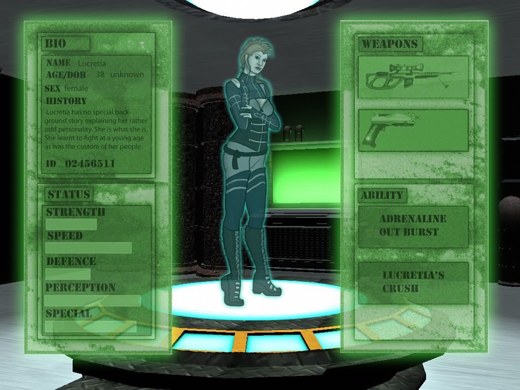
First up- Lucretia's portrait. Hopefully it looks ok- I'm happy with it so far but there is something that is bothering me about her. I've tried to roughen her up a bit- I found some fantastic brushes on DeviantArt that have really helped.

Please ignore the crappy excuse for a background for now- I'll attempt to do more of that once the rest of her is finished.


Still left to finish is her ear, hair and goggles. The short hair turned out to be really easy once I found the right brush. Not completly finished with it but I think it's a start. I played around with her right eye and her mouth, and I think they look a little better now. Also made her paler, and I think she looks unhealthy now :D Which was my aim.

Erm..... so all in all I have today- Finished her clothing and added in her eyebrow piercings, worked on the mohawk, messed with her features until I was happier, added more textures, cleaned the image up and tried to improve the composition.

So I'm nearly done on this one thankfully. The background is gonna give me troubles I think, even though it wont be a detailed one. We'll see once I get to it.

Secondly:

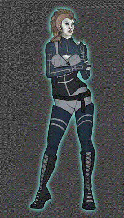
Originally I started a turn around animation as one of my final assets, but then decided I didn't like it, didn't want to do an animation, wanted to only do concept art, etc...bla bla bla whine whine whine.

And then yesterday for some reason I really had the urge to do a animation, so here we go:


As you can see she doesn't have a face yet- I think thats going to be one of the hardest parts- making it look consistant and like it's the same person.

I've tried it out in flash though and it looks ok- not amazingly smooth but it works. I don't have time to do any more inbetween frames, and I kinda actually like the jerky movements- It'd be cool if I could some how animate it as though she's a hologram on Cat's platform, complete with flickering, see through what nots going on... if that makes any sense at all. I'll see what I can do and ask around if anyone has any ideas as to how I could achieve that.

I heavily referenced a pose from PoseManiacs for this one- I would have been screwed without it :3

Err, thats it for now methinks. I have one last thing to upload but it's traditional so I had to take a picture with a friend's camera. I'll get that from her later and upload hopefully tonight.